
The All India Ophthalmological Society is one of the largest ophthalmological bodies in the world — more than 26,000 members, and a history running back to 1930. A society of that standing communicates with its members constantly. What it did not have was a publication that looked like it belonged to it.
AIOS Times existed before we arrived, but it appeared sporadically — a handful of issues spread across six years, each one assembled rather than designed. For members who read the best-produced international journals in the field, the distance between the society’s standing and its own printed voice was visible on every page.
What the editorial leadership asked for was not a template. It was a system that could deliver four times a year, every year, without fail: a typographic hierarchy that lets a 180-page issue breathe, feature openers with room to be dramatic, data pages engineered for scanning, clinical imagery handled to diagnostic standards. Recurring sections carry consistent visual signatures, so a member navigates an issue by instinct rather than by contents page.
Since the January–March 2024 issue, AIOS Times has published every quarter without exception — ten consecutive issues, with the eleventh now underway. In society publishing, where journals routinely stall between committee terms, cadence is the rarest deliverable of all. The full run is publicly archived at edu.aios.org/aios-times, so none of this has to be taken on trust.
It has run as a simultaneous print and digital edition since the first redesigned issue. The first one was built for digital release; senior members saw it and wanted something they could hold, which is a better verdict on a layout than any metric.
In 2026 the magazine opened to paid advertising. That is the line worth reading slowly. Advertisers do not buy pages out of goodwill — they buy readership they believe in. A well-designed member magazine is a cost a society carries for its members; one that attracts advertisers is an asset that pays for itself. We are now extending the system to carry that properly: ad positions planned into the pagination rather than dropped onto it, ratios that keep the reading experience intact.
The relationship has widened well past the quarterly — two ophthalmology textbooks, and the social programme that carries each issue. Both books are below, and they are not the same problem: one is a reference volume built to be searched, the other a practical manual built to be used in an operating theatre.
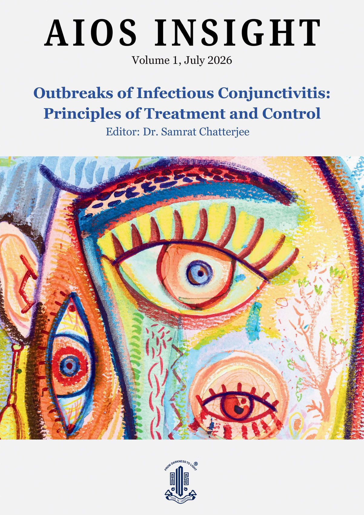
Outbreaks of Infectious Conjunctivitis — a reference volume, built to be navigated rather than filed.
One of the two textbooks we have designed for the Society: AIOS Insight — Outbreaks of Infectious Conjunctivitis: Principles of Treatment and Control, edited by Dr Samrat Chatterjee.
A textbook is not a long magazine. Nobody reads it front to back. A clinician arrives with a specific question — an attack rate, a transmission route, a treatment protocol — and needs to reach the answer without reading the forty pages that precede it. So the table of contents does real work here: three numbered tiers, every subsection listed, page numbers set large enough to find with a thumb. It functions as an index, not a formality.
The cover breaks deliberately with the quarterly. Where AIOS Times runs a painted, expressive image, this uses a single tightly-cropped illustration and a plain typographic stack — closer to a scientific report than to a magazine, which is exactly the signal a reader should get before opening it.
Inside, two registers run side by side. Narrative chapters carry a numbered opener, generous measure, and clinical photography sized to be diagnostic rather than decorative. The comparison tables run landscape across the portrait page — a production decision made for space, and left as the book has it, because a table that fits is worth more than a table that reads the right way up.
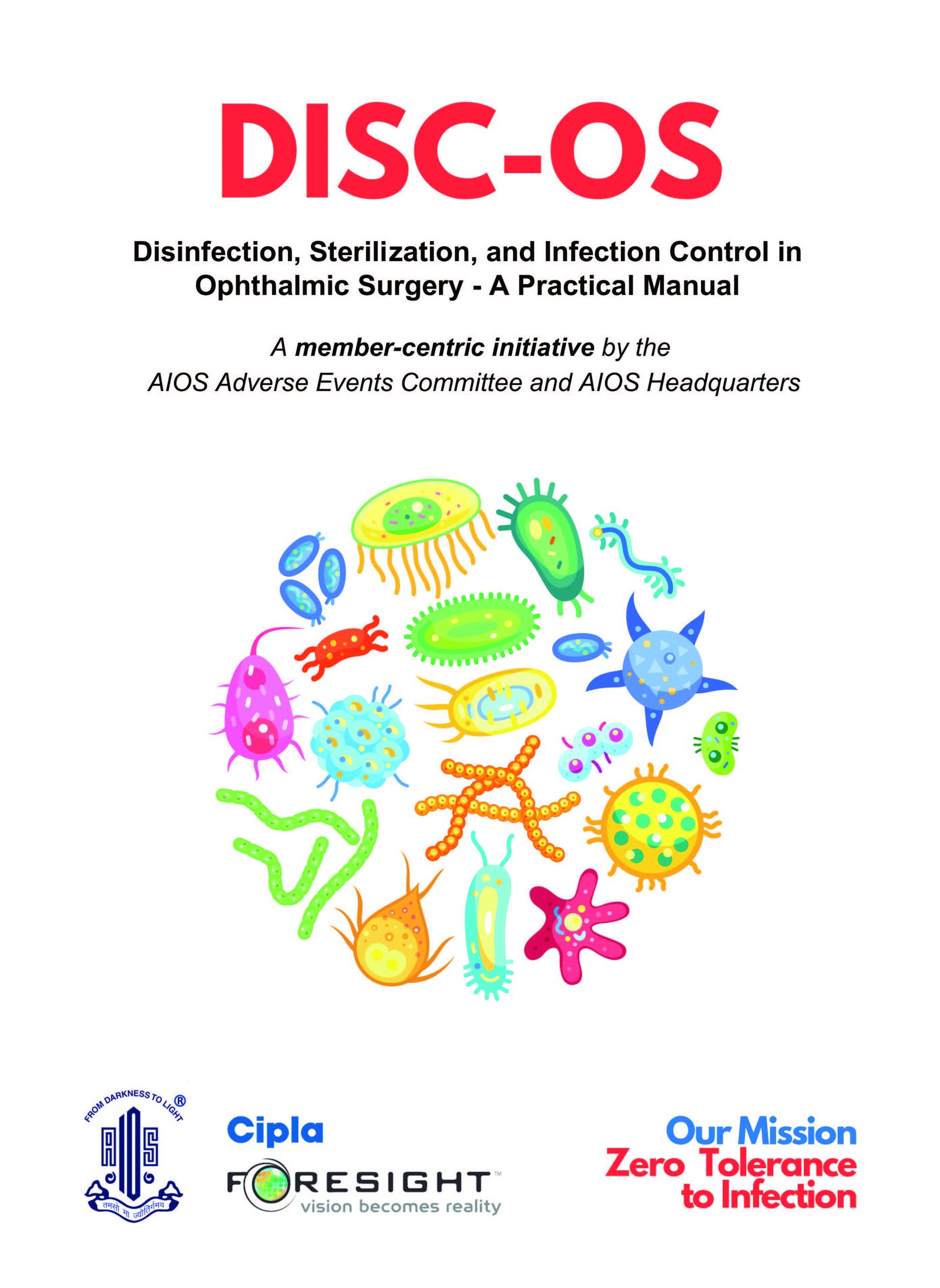
A manual written to be used in an operating theatre, not read in an armchair.
The second of the two textbooks: DISC-OS — Disinfection, Sterilization and Infection Control in Ophthalmic Surgery, a practical manual from the Society’s Adverse Events Committee. Eleven chapters, eleven different authors, one subject that does not tolerate ambiguity.
The design problem is not density, it is destination. Almost nothing here is read at a desk. A protocol for instrument sterilisation is consulted next to an autoclave; a handwashing sequence is looked at with wet hands; a checklist for cluster endophthalmitis is opened by somebody who has a problem right now. So the book is built as a set of arrival points rather than a continuous argument — every chapter opens on a full page with its author named and pictured, the contents page is set to be found by thumb, and protocol tables are given whole pages rather than being squeezed around text.
The handwashing page is the clearest statement of intent. It is a wall poster that happens to be bound into a book — numbered, illustrated, wordless where it can be, designed on the assumption that somebody will photograph it and stick it above a sink. A page that leaves the book is a page that worked.
Clinical photography runs throughout — theatre setups, draping, instrument trays, post-operative presentations — sized to be diagnostic rather than decorative, which is a different instruction from making it look good, and occasionally the opposite one.
The book carries pharmaceutical sponsorship. Those pages sit at the front and back, outside the editorial block entirely, so that a reader never meets an advertisement in the middle of a protocol. That principle — advertising planned into the pagination rather than dropped onto it — is the same one now being extended across AIOS Times.
We stopped promoting the issue and started teaching people how to read it.
Most journal social media is an announcement service. New issue out now. Link in bio. Nobody opens it, because nothing has been said about what is actually inside.
Vol. 3, Issue 2 — Ocular Oncology, themed Jungle Book — gave us a better option. AIOS Times is built from named recurring sections, and those names are the best writing in the publication: Eye Rest My Case for the debate pieces, EyeSee for the interviews, Eyedea for new research, Eyedvantage for clinical reviews, Eyeducation for the teaching pieces, Eyetalics for personal essays, Eyewitness for first-person accounts, Retrospectacles for the history. So we built the campaign as the contents page, one post at a time. Each post is a single section, its real spread, its real headline, its real authors.
That does something an announcement cannot. A reader who follows the campaign for a fortnight learns the architecture of the magazine — where the debate lives, where the essays live, which section they personally read first. By the time the issue lands they are not being told it exists. They are looking for a part of it.
The spreads are shown as spreads, photographed on a plain ground rather than flattened into graphics, because the argument of the whole project has always been that this is a publication worth holding. The Jungle Book theme carries the ocular oncology issue without ever making light of it — the tiger and the leopard belong to the essays, not to the case reports.