
A trust that treats the village as the archive.
The Indian Trust for Rural Heritage and Development, ITRHD, was set up in 2011 on a simple argument: about 70% of India lives in villages, and those villages hold much of what the country has inherited. Buildings, crafts, music, knowledge. Conserve that, and you give people a reason, and a livelihood, to stay where they are.
The work is concrete. Silk weavers in Mubarakpur. Black-pottery makers in Nizamabad. The musicians of Hariharpur. An eighteenth-century garden at Rajnagar. A jail in Jharkhand where Birsa Munda was held. Weavers in Pochampally, craftspeople in Barmer, a living-cultures museum planned for Nagaland.
ITRHD documents, restores and publishes. It also puts artisans in front of buyers, so the money reaches the people who made the thing.
We have worked with them since 2024. Their conference, their book, their festival. Different formats, one problem: how do you make heritage look as serious as it is?
15 Years of ITRHD
The brief was short: celebrate fifteen years. We wrote the script, cut the film and finished it, start to end. Fifteen years of villages, artisans and restorations, in one sitting.
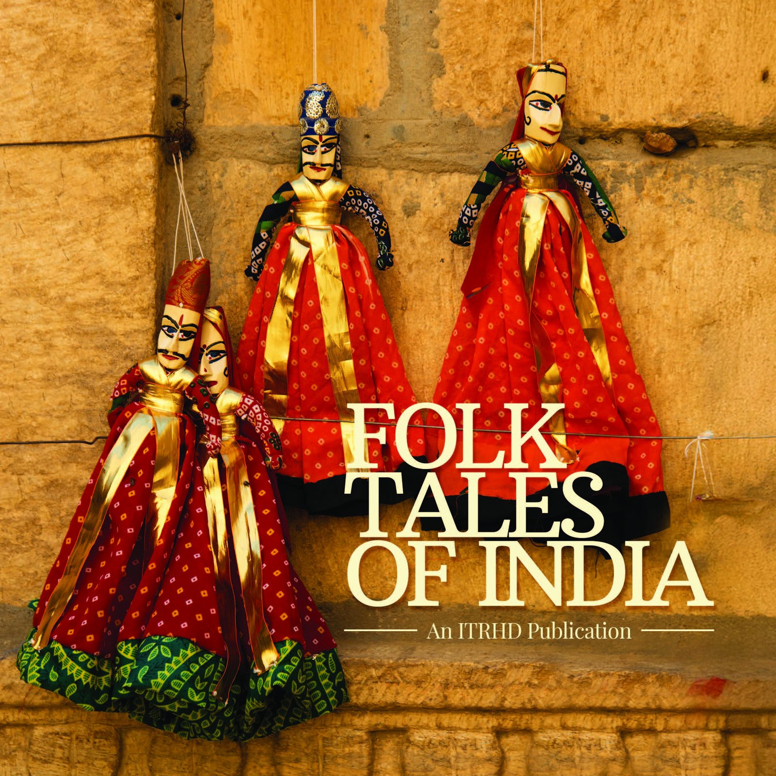
Folk Tales of India — published, announced, and in distribution.
ITRHD’s Folk Tales of India collects folklore from across the subcontinent alongside scholarly essays on what a folk tale actually is, how it travels, and what happens to it under Sanskritisation, heritage tourism, and plain neglect. It is two books sharing one spine: an anthology and an academic volume. Our job was to stop them fighting each other.
Each essay opens on a full-page commissioned illustration — Madhubani birds for the chapter on cultural heritage tourism, a Kashmiri miniature for the folklore of Jammu and Kashmir, a Gond roundel for Madhya Pradesh. The artwork is not decoration. It is the signal that a new voice has started. Underneath it, body text is set quietly in a single measured column, so the illustration carries the drama and the scholarship stays readable.
The archival section — stories collected by Lal Behari Dey, F. M. Gordon, and Cornelia Sorabji — runs on a warmer paper tone. A shift in stock rather than a shift in design. You know you have crossed into older material without anyone telling you.
The book is now published, formally announced, and in distribution.
The 13th Annual Handloom & Handicrafts Festival, built from zero.
The festival ran 27–30 September 2026. ITRHD was starting over on two new social profiles: no followers, no content system, nothing to build on. So we started at the beginning: a visual language for the festival, artwork, reels and daily coverage across all four days. Artisans first, then the event.
By the final day, the profiles had a voice and an audience. The groundwork is laid.

Their annual conference — the International Conference for the Preservation of Rural Buddhist Heritage — brings together archaeologists, policy makers, monks, and academics from across Asia and Europe. The communication design had to work in two registers simultaneously: the gravitas of the subject matter, and the accessibility required to speak to an international, multilingual audience.
We built a visual identity for the PRBH conference anchored in the material culture of Buddhist India — the ochre of sandstone, the weight of carved inscription, the geometry of stupa architecture. The iconography drew from Sanchi and Ajanta without being derivative. It felt ancient and contemporary at once.
From entrance gates at the Ambedkar International Centre to stage backdrops, rollup banners, delegate kits, and digital assets — every touchpoint was part of the same coherent visual argument: that heritage conservation is not a niche concern, but a civilisational one.
A conference identity carried into the physical space.
The same system moved from screen to site: entrance structures, registration, auditorium graphics and wayfinding at the Dr Ambedkar International Centre. The photographs show the identity working at architectural scale rather than as isolated artwork.